The shape of colour: how colour shapes perception, identity and the way we design
Colour is more than aesthetics. It shapes how we perceive, feel and connect with the world. Explore how science, culture, identity and sustainability influence colour in design, and why understanding it leads to more meaningful products, brands and experiences.
Colour is more than a visual decision
Colour is one of the most familiar elements of design, yet it is also one of the least understood. Designers work with colour every day, choosing palettes for interfaces, products, buildings, brands and environments. These decisions are often guided by visual appeal, brand guidelines, personal preferences or established conventions. However, colour influences much more than how something looks. It affects how people recognise objects, interpret information, form emotional connections and experience their surroundings.
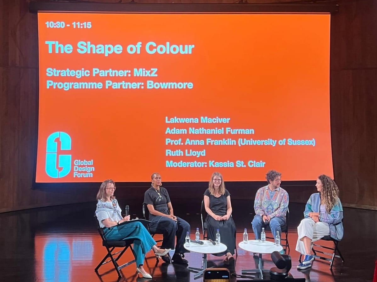
During London Design Festival 2026, members of the Extended Pack Collective attended The Shape of Color, a discussion at the Victoria and Albert Museum that brought together perspectives from visual science, architecture, art and sustainable textile innovation.
Moderated by writer and cultural historian Kassia St Clair, the conversation featured Professor Anna Franklin, a researcher in visual perception and cognition at the University of Sussex; Adam Nathaniel Furman, an artist and designer working with architectural colour; and Ruth Lloyd, a textile design researcher exploring microbial colour production, alongside Lakwena Maciver, an artist whose practice uses colour as a means of expression and public engagement.
The discussion challenged several assumptions about colour, particularly the idea that its effects are universal, that neutral environments are inherently better, or that colour is simply a finishing treatment applied after the important design decisions have been made.
For designers, product managers and business leaders, the conversation offered a broader understanding of colour as a functional, cultural, emotional and material component of the things we create.
Colour is a fundamental part of human experience
Colour helps people navigate the world long before they consciously think about it. It allows us to identify objects, distinguish between similar things, recognise whether food is ripe and understand information quickly. These functions are so familiar that we rarely acknowledge how much we depend on them.
Professor Anna Franklin explained that colour plays a fundamental role in human behaviour and perception. Finding a particular car in a parking area would be much harder if every vehicle looked the same grey. Similarly, recognising the condition of food or identifying an object among several alternatives often depends on colour.
This makes colour a functional element rather than merely decorative.
In product design, colour can help users distinguish actions, understand categories, recognise system states and navigate complex interfaces. In physical environments, it can support orientation and differentiate spaces. For businesses, consistent colour associations can help people recognise products and services.
Yet many design processes treat colour as something to add at the end. Adam Nathaniel Furman pointed out that architectural education and practice often give greater attention to materials, spatial organisation and structure while treating colour as secondary.
The problem is that colour shapes how those elements are experienced. Colour should be considered alongside form, material and function, not after them.
A product's appearance, usability and emotional character develop together. Treating colour as an independent layer can prevent designers from understanding its full contribution.
The meaning of colour is not universal
One of the most important discussions concerned the relationship between colour, biology and personal experience.
Human colour perception begins with the visual system. Receptors in the eyes process light reflected from objects, and the brain interprets it. However, biology alone does not determine the resulting experience. Culture, memory, environment and learning all influence how people perceive and respond to colour.
Anna described research suggesting that even people's perception of white can vary according to where they live and where they grew up. The environment experienced during early development appears to influence how the brain calibrates colour perception, while present surroundings continue to shape that experience.
This challenges the assumption that everyone experiences the same colour in exactly the same way.
The discussion also examined the popular belief that individual colours produce predictable psychological responses. Red is frequently associated with urgency or excitement, while blue is often described as calming or trustworthy. Such associations have become common in branding, marketing and interface design.
However, scientific findings about colour and behaviour are considerably more complicated.
Research has identified relationships between colour, mood and performance, but many reported effects are small, temporary or difficult to reproduce consistently. Their influence often depends on the individual, the situation and the surrounding environment.
A colour that communicates reassurance in one setting might communicate something entirely different in another. Its meaning can change depending on the product, audience, cultural background and personal associations involved.
Colour psychology is not a universal rulebook. It is a contextual part of understanding human experience.
Rather than choosing colours because of widely repeated psychological claims, design teams should examine how their intended audience interprets those colours in the context of the actual product or service.
Colour is closely connected to identity and memory
Colour preferences are often discussed as matters of taste, but the conversation revealed how closely they can be connected to identity.
Anna described a study in which participants viewed colours during brain imaging and indicated which ones they preferred. The researchers observed activity in brain regions associated with processing self-identity when participants responded positively to colours.
This suggests that colour preference is not simply an aesthetic judgement. It may connect to how people understand themselves.
Personal memories provide another layer of meaning. During the discussion, one artist described a dislike of maroon that began when they wore it as a school uniform. The colour itself was not necessarily unpleasant, but its association with a particular period of life influenced the response.
These relationships help explain why colour can produce strong and sometimes unexpected reactions. A colour associated with childhood, family, cultural celebrations, or a familiar environment may carry emotional significance that colour theory alone cannot explain.
This becomes particularly relevant when designing products that people are expected to develop lasting relationships with.
During the audience discussion, an EPC participant working in product design raised the relationship between colour, cultural background and people's emotional attachment to objects. The question explored where scientific understanding ends, and personal or cultural interpretation begins.
Furman's response highlighted the importance of understanding colour through multiple levels of identity. In public projects, he examines the colours associated with a location, the cultural backgrounds of its communities and the personal experiences of people who will interact with the work.
This approach can be extended to consumer products, services and brands. Design research should not focus exclusively on what users find visually attractive. It should also investigate the associations that make certain colours meaningful, familiar or uncomfortable.
People do not experience colour in isolation. They experience it through everything they have learned, remembered and associated with it.
Material changes the way colour is experienced
Colour cannot be fully understood without considering the material on which it appears. A particular shade of blue may look different on ceramic, fabric, painted metal or a digital screen. Surface texture, reflectivity, translucency and lighting conditions all influence its appearance.
Furman's architectural practice demonstrates this relationship particularly well. He described his preference for glazed ceramics partly because of their remarkable durability and partly because of how their surfaces respond to light.
A ceramic glaze can appear different throughout the day as the surrounding light changes. The surface's three-dimensional form also affects its visual character. Producing the intended result requires considerable experimentation with materials, glazing and manufacturing processes.
For major architectural projects, Furman described development periods that can extend across several years, including substantial research and testing before manufacturing and installation.
This introduces an important consideration for designers working across physical and digital environments. Colour specifications alone do not guarantee a consistent experience. A colour selected on a computer display may behave differently when transferred to packaging, textiles, painted surfaces or architectural materials.
Even in digital products, surrounding colours, display conditions and contrast can alter perception. Design teams therefore need to evaluate colour in the environment where it will actually be experienced.
A colour specification describes an intention. The material and environment determine much of the experience.
Sustainable colour requires rethinking how it is produced
The environmental impact of colour production formed another important part of the discussion.
Ruth Lloyd's research focuses on microbial textile colouration, an emerging approach that explores using microorganisms to produce colourants as alternatives to conventional synthetic dyeing processes.
Traditional textile colouration can involve substantial water, energy and chemical use. Rather than suggesting that sustainability requires eliminating colour, Lloyd argued for developing better methods to produce and apply it.
Her work examines whether microbial colourants can achieve the technical performance required for industrial use, including resistance to washing, rubbing and light exposure.
An important consideration is reproducibility. Industrial production requires colour to remain consistent across repeated manufacturing processes. A sustainable alternative must therefore be evaluated not only by its environmental potential but also by its reliability and performance.
Lloyd discussed how synthetic biology may allow microorganisms to produce specific pigments found in nature. Instead of extracting a complex mixture of pigments from plants, researchers can explore producing selected colourants with desirable characteristics.
This could eventually expand the range of available colours while improving production processes. However, microbial colouration remains an emerging field, and its broader industrial potential is still being developed.
The discussion also showed that some colours are technically harder to produce than others. Black, for example, presents particular challenges in textile dyeing, especially when achieving depth and long-term colour stability.
For businesses, this creates a useful connection between design decisions and production responsibility.
A colour choice can influence manufacturing complexity, durability, environmental impact and replacement cycles. These consequences are rarely visible in a finished product, but they remain part of its design.
Sustainable colour is not simply about choosing a natural-looking palette. It is about understanding how colour is made, applied, maintained and eventually discarded.
Neutral design is not automatically better design
The conversation also challenged the growing preference for beige, muted palettes and visually restrained environments. Social media has accelerated the popularity of certain aesthetics, including highly neutral interiors, products and learning spaces.
Franklin questioned claims that colourful environments are inherently distracting, particularly for children or neurodivergent individuals. Her research experience suggests substantial variation in individual preferences, including among autistic people, some of whom strongly enjoy bright and intense colours.
This is an important distinction because visual simplicity and the absence of colour are not the same thing. A restrained environment may be appropriate for a particular purpose, but it should not automatically be considered more inclusive or comfortable.
At the same time, the discussion identified circumstances in which colour arrangements can create genuine visual discomfort.
Franklin explained that tightly repeated patterns with strong colour contrast can be visually demanding. The relationship between contrast, repetition and spatial frequency influences how comfortably the visual system processes an image.
This suggests that the way colours are arranged can matter as much as the colours themselves. For interface designers, this has direct implications for contrast, visual density, repeated patterns and information hierarchy. For architects and interior designers, it encourages a more considered approach to the interaction between colour, scale and space.
The objective should not be to maximise or minimise colour indiscriminately, but to understand what the environment requires and how different people might experience it.
Colour trends should not determine long-term design decisions
Colour trends spread rapidly through social media, fashion, interiors and consumer products. A particular palette can become popular across several industries within a short period.
While trends can reflect changing cultural preferences, the discussion questioned whether they should influence decisions intended to last much longer.
Lloyd observed that trends can encourage unnecessary consumption by making people feel that existing products have become outdated simply because their colours are no longer fashionable. This is particularly relevant to businesses developing long-lasting products and brand identities.
A brand that repeatedly changes its visual identity to follow trends risks weakening the associations customers have developed with it. Similarly, products designed around temporary aesthetics may become less desirable before reaching the end of their functional life.
The audience raised this issue directly by asking how brands can respond to changing colour trends without losing their identity.
The discussion suggested that lasting colour decisions should emerge from genuine relationships, meaningful associations and clear design intentions rather than external pressure to remain fashionable.
For product teams, this does not mean avoiding experimentation. It means distinguishing between temporary expressions and the elements that give a product or brand continuity.
A lasting colour identity is built through meaning and consistency, not through constant participation in trends.
Designing with colour requires conversation, not just selection
Perhaps the most useful lesson from the discussion was the importance of treating colour as something to investigate with people rather than simply choose for them.
Furman described how his public projects involve conversations with clients, communities and other stakeholders to understand the different meanings associated with colour.
These discussions operate across several levels: the identity of a place, the cultural histories of its communities and the personal memories of individuals. The final design emerges through negotiating these different perspectives.
This offers a practical model for design teams working on products, brands, services and public environments.
Colour decisions can be informed by user research, cultural understanding, material testing and the intended lifespan of the experience. The objective is not to discover a universally correct palette, but to make choices appropriate to the people, purpose, and context involved.
It also requires recognising that not every reaction can be anticipated. People bring their own histories to the things they encounter, and those histories influence interpretation.
A thoughtful colour strategy therefore combines scientific evidence with human understanding and practical experimentation.
Colour deserves a place at the beginning of design
The Shape of Colour demonstrated that colour sits at the intersection of perception, culture, identity, material science and environmental responsibility.
It influences how people recognise and understand the world, but its meaning is never entirely fixed. It can create familiarity and attachment, yet the same colour may produce different responses across individuals and communities. Its appearance depends on material and lighting, while its production can carry significant environmental consequences.
For designers and business leaders, the implication is straightforward. Colour deserves the same level of attention given to usability, material selection, product strategy and other fundamental design decisions.
The most valuable learning is to stop treating colour as a final visual treatment and begin considering it as part of how a product, service or environment works.
When colour is understood through the people who experience it, the materials that carry it and the systems that produce it, designers can make decisions that are more meaningful, responsible and durable. That is where colour moves beyond aesthetics and becomes an essential part of design.
Editorial note: This article is based on the discussion attended by Extended Pack Collective members during London Design Festival 2026. It synthesises the session's main ideas rather than reproducing the conversation verbatim.

Comments ()